Have you ever considered the emotional influence that the colours in your home can have? From paint and furniture to rugs and upholstery, the colours we choose can play a big role in how we feel. Let’s delve into the fascinating world of colour psychology and unravel the secrets behind crafting the perfect ambience.
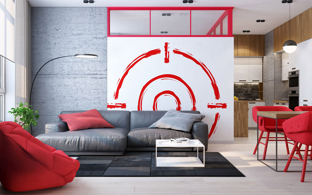
Red is a powerful and bold choice, associated with passion, vitality, and excitement. It is often used to create a sense of energy and intensity within a space. It can be employed as an accent colour to draw attention to specific elements or as a dominant hue to make a dramatic statement. It is important to use it sparingly to avoid it feeling too intense or overwhelming.
Yellow is often utilized to create a vibrant and energetic atmosphere. It is known to evoke feelings of happiness, optimism, and warmth. Yellow can be incorporated through various elements, such as accent walls, furniture pieces, accessories, or even lighting fixtures. In spaces where natural light is limited, yellow can help to brighten the room and create a sense of sunlight.
Blue is frequently used to create a calming and serene atmosphere. It is associated with feelings of tranquillity, relaxation, and stability and is often used in bedrooms and bathrooms to create a spa-like feel. Blue is also known to enhance focus and concentration, making it suitable for study areas or offices.
Green creates a sense of harmony, freshness, and nature-inspired tranquillity. It is a versatile colour that can be used in various shades, ranging from vibrant greens to muted earthy tones. Green is often used in spaces where relaxation and rejuvenation are desired, such as bedrooms, living rooms, and spa-like settings. Pairing effortlessly with natural materials like wood and stone, it can also bring a sense of connection to the outdoors.
White creates a sense of cleanliness, simplicity, and spaciousness. White reflects light and can make a space appear larger and brighter, making it a popular choice for small or dimly lit rooms. White is often used in minimalist and modern designs, as it provides a clean and uncluttered aesthetic, allowing other design elements to stand out.
Black is associated with a sense of sophistication, elegance, and drama. It is a powerful and bold colour that can add depth, contrast, and make a strong visual impact in a space. It is highly versatile, pairing well with a wide range of colours. It also creates a luxurious and refined look, especially when combined with metallic accents.
Grey is associated with a sense of elegance, sophistication, and neutrality. It is a versatile and timeless colour that can serve as a neutral backdrop or as a complementary hue in combination with other colours. Grey is often used in minimalist or modern designs to provide a clean and understated aesthetic. Its calming and balanced nature can evoke a sense of relaxation and serenity.
Purple is a rich and regal colour that can evoke an atmosphere of luxury, creativity, and imagination. It can add a sense of opulence and sophistication to a space and is commonly used in bedrooms, lounges, and dining rooms. It also works well as an accent colour, adding a touch of depth and richness to a space.
Pink is associated with a sense of softness, femininity, and playfulness. It is a gentle and soothing colour that can add a touch of romance and sweetness to a space. Pink is often used in bedrooms, nurseries, or spaces dedicated to relaxation. However, it’s important to strike a balance when using pink, as excessive use or overly bright shades may create an overwhelming or juvenile atmosphere.